

More website traffic won’t generate calls if visitors can’t see what to do next. If you’re asking why your website is not generating any leads, unclear calls to action may be creating friction between interest and inquiry. Make the next step specific, visible, and easy to take.
It’s frustrating to see people visit your site without reaching out. The issue may not be a lack of interest: a vague button, hard-to-find phone number, or lengthy form can make a ready-to-talk visitor hesitate. Clear calls to action show people how to get in touch, what to expect, and why taking that step makes sense.
This article explains how to spot CTA problems, make it easier for visitors to call, and assess whether the wider site experience is getting in the way. You’ll also learn when your website’s messaging, design, or development may need a more strategic fix.
Key Takeaways
- Use current testimonials, case studies, and real team details to help visitors feel confident contacting your business.
- Make each call to action clear, visible, and easy to act on, with a next step that matches the visitor’s level of interest.
- Assess whether unclear messaging, confusing navigation, or mobile usability is blocking inquiries before changing the whole site.
- Make phone contact simple to find and use, so visitors who are ready to talk can call without friction.
1. Building trust with testimonials, case studies, and credentials
Visitors need evidence before they decide to call, especially when your messaging asks them to trust an unfamiliar business. Make customer reviews, case studies, credentials, professional design, and real team photos easy to find. Each signal addresses a different concern: customer feedback shows others have engaged, while a case study explains how a specific challenge was addressed.
Fresh reviews can make a stronger impression than a large but inactive review count. For example, a business with 40 reviews, including three new ones that month, may appear more actively trusted than one with 200 reviews and none added in two years. Keep review dates visible and choose feedback that reflects the services your audience is considering. A review from two years ago can make a local business’s feedback look outdated.
Make testimonials specific. “Great service” offers little detail; a comment describing the problem, experience, and result helps visitors understand what working with you involved. Get permission before publishing a customer’s name, photo, or company details. Place relevant testimonials beside the service or contact information they support instead of hiding every review on one page.
Structure case studies around a clear sequence: the customer’s challenge, the work completed, and the outcome. Include concrete details the customer has approved, such as the project scope or a before-and-after comparison. Don’t imply that one customer’s result is typical for everyone. Real team photos and concise staff bios can also help visitors connect a business with identifiable people.
Credentials should be current, relevant, and easy to understand. Show the issuing organization and credential name, then explain why it matters to the service. Never use a badge without permission or present an award as a certification. The U.S. Environmental Protection Agency notes that audience segmentation can help tailor messages to people’s needs and knowledge. Match trust signals to the visitors’ concerns, then review their placement alongside traffic and inquiries.
2. Calls to action
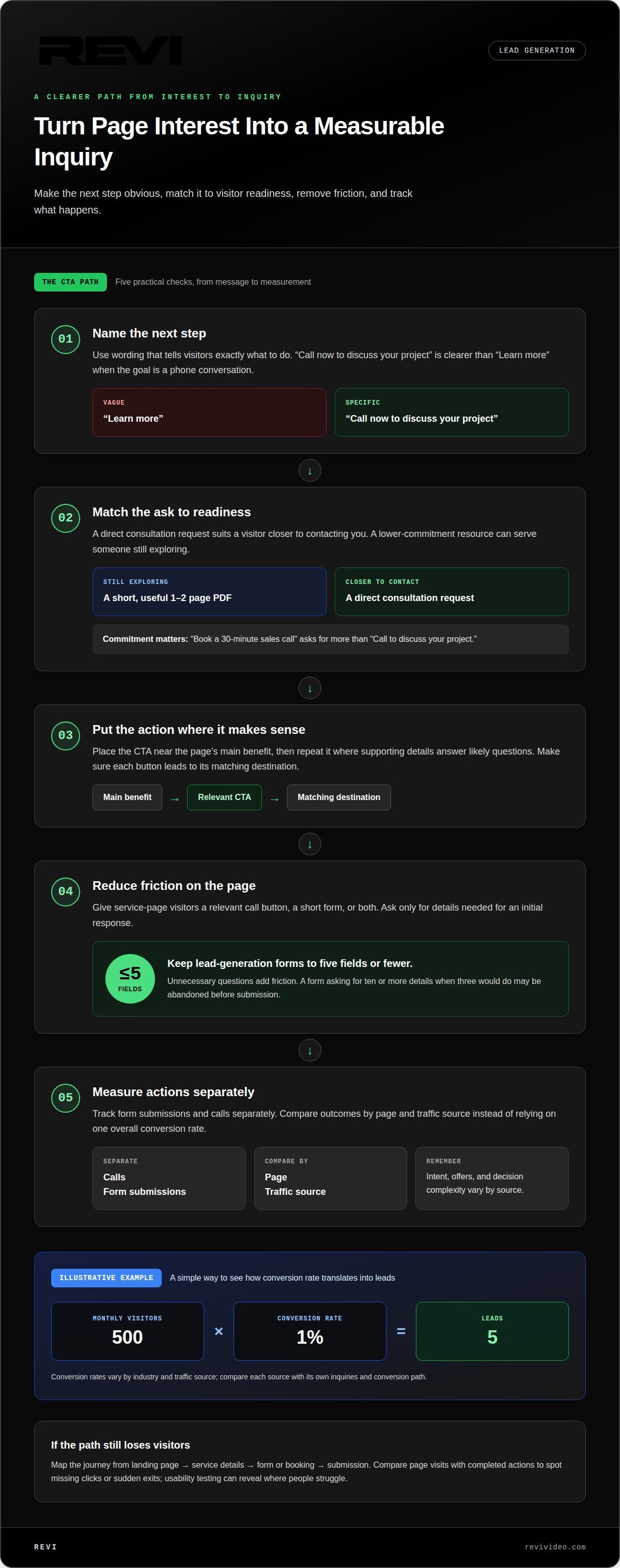
A call to action should name the next step rather than make visitors guess. If you’re asking, “Why is my website not generating any leads?” check whether each page makes the action obvious. “Call now to discuss your project” is clearer than “Learn more” when a phone conversation is the goal. Place the action near the page’s main benefit, then repeat it where supporting details answer likely questions. Each button should lead to its matching destination.
Conversion rates vary by industry and traffic source because visitor intent, the offer, and decision complexity differ. Someone arriving through a service-specific search may be closer to contacting a business than someone browsing a general article. Compare each source with its own inquiries and conversion path; an overall rate can hide where interested visitors drop away.
Messaging shapes whether visitors recognize the value proposition and act. State who the service helps, what problem it addresses, and what happens next. For example, “Book a 30-minute sales call” asks for a bigger commitment than “Call to discuss your project.” Match the request to the visitor’s readiness, and explain useful next-step details beside it.
Make the path to action simple. A visitor reading a service page should find a relevant call button, a short form, or both. Ask only for details needed for an initial response; unnecessary fields add friction. To answer “why is my website not generating any leads?”, inspect the headline, CTA wording, button visibility, and destination before changing unrelated content.
Content can prompt action by resolving the concern that blocks the next step. A pricing-process explanation, service comparison, or concise project example can lead naturally to an inquiry link. Track form submissions and calls separately, then compare results by page and traffic source. An illustrative example: 500 monthly visitors at a 1% conversion rate produce 5 leads. For clearer conversion paths, website development can align page messaging, calls to action, and destinations.
3. Does website design affect lead generation?
Yes. Design can hide the next step, slow a page, or make a form feel broken. A professional starts by reviewing the previous 90 days of analytics, tracking, top pages, and current inquiries. That separates a traffic problem from a conversion problem and shows where lead generation loses momentum.
To find funnel drop-offs, map each step: landing page, service details, form or booking, then submission. Compare page visits with completed actions to locate missing clicks or sudden exits. Usability testing adds context: observe members of your target audience as they complete tasks and note where they struggle.
A professional can improve calls to action by matching button language to the page and destination. They simplify forms by removing fields that aren’t needed for an initial inquiry; keep lead-generation forms to five fields or fewer. If a form asks for ten or more details when three would do, visitors may abandon it before submitting.
Lead magnets can offer different commitment levels. A short, useful 1-2 page PDF may suit someone not ready to book, while a direct consultation request fits a visitor closer to contacting the business. Professionals connect each offer to relevant content, then track downloads, submissions, and booking completions as separate actions.
US lead-form requirements depend on applicable laws, the information collected, and how it’s used. A privacy notice should accurately explain those practices; legal review should account for relevant federal and state rules.
There’s no universal budget for website lead generation. Scope investment around the diagnosed issue, project needs, and whether the work involves focused design updates or larger structural changes.
Quick fixes to calls to action, forms, and trust signals can show results in 2-4 weeks. Larger structural changes typically take 2-3 months to implement, followed by another 30-60 days to measure results. Compare performance after 30 days, then continue monthly tracking to see whether the changes improve inquiries.
4. Generating phone calls from a website
Traffic without calls often points to a gap between interest and action. A visitor may want help but struggle to find a phone number, understand the service, or know what to say. Put a visible phone number near the page’s main call to action. Pair it with a direct prompt, such as “Call to discuss your project,” so visitors know what happens next.
Mobile access matters because over 60% of web traffic comes from mobile devices. Make the phone number tap-to-call, keep buttons easy to select, and avoid placing contact details inside small print. A site should load in under about three seconds on a phone using cellular data. Slow loading can cost you the chance to connect before visitors see the number.
Use each page to answer a caller’s first questions. A service page can explain what the business does, whom it helps, and which issue it solves. Place a call prompt beside that information. Keep ad messaging consistent with the landing page so visitors who click an ad find the offer they expected.
Track phone clicks separately from completed calls. Click data shows that someone tapped the number, but doesn’t prove a conversation happened. Compare those clicks with actual inquiries to identify where the path breaks. If traffic without calls persists, review page relevance, phone visibility, mobile layout, and message match before changing unrelated content.
Make the call feel straightforward. Explain whether people should call for an estimate, a service question, or help choosing a next step. Avoid competing buttons that send visitors in different directions. A clear phone path builds from relevant traffic, useful information, and an obvious action. To improve the route from a visit to a call, strengthen your website’s phone conversion path.
REVI: Website Development
REVI’s Website Development can help when traffic reaches your site but calls and inquiries don’t follow. It addresses the issues covered here: unclear page messaging, hard-to-find phone details, and conversion paths that make the next step difficult. The goal is a website that explains your offer and makes it easier for interested visitors to act.
Turn to REVI when your site needs more than a button adjustment, such as when its structure, design, or content fails to support lead generation. If advertising brings visitors to pages that don’t match the campaign message, REVI’s Ad Buying & Management can help align those parts of the journey. The right focus depends on where visitors lose momentum.
Share what your website should help people do, such as call about a service or submit an inquiry. Contact REVI to discuss your website’s lead-generation needs.
Turn your next insight into action
If you’re still asking why your website isn’t generating any leads, treat that question as a starting point, not a verdict. Look for the gap between what you promise and the next step visitors can take. Then focus your next improvement on that gap rather than changing everything at once.
REVI can connect your website experience with how your business attracts and engages its audience. Its Website Development, Ad Buying & Management, and Video Production services can support different parts of that journey, from the landing page to the content that brings people there. The right focus depends on what your site needs to do.
Contact REVI to discuss your website and the changes that could make its next step clearer. A more focused path gives interested visitors a better reason to move forward, and gives your business a stronger foundation to build on.
Frequently Asked Questions
Why is my website getting traffic but no leads?
Traffic may come from visitors whose needs don’t match your offer. For example, a page attracting people seeking general information may not persuade someone ready to hire a local service. Compare the search or ad message that brought visitors with the page they land on. If expectations differ, relevant visitors may leave without contacting you.
How many leads should a small business website generate?
There’s no single lead target that fits every small-business website. A useful goal depends on qualified traffic, the service’s sales cycle, and how many inquiries the business can handle. A seasonal business and a specialist service with a longer decision process may need different benchmarks. Set a target using past inquiry data and the number of suitable customers the business can serve.
Does website design affect lead generation?
Yes. Design affects how easily visitors understand a page and complete an action. Low-contrast text, for example, can make service details difficult to read, while a layout that shifts on a phone can obscure important information. Clear visual hierarchy helps people distinguish the main offer from supporting content, making the page easier to use and navigate.
How can a professional improve website conversions?
A professional can trace the visitor journey, identify points of confusion, and prioritize changes based on their likely impact. They may compare page layouts or button wording, then monitor how visitors respond. For example, if people open an inquiry form but don’t finish it, the team can investigate the form experience instead of redesigning unrelated pages.
How can a professional determine whether the problem is traffic or conversion?
Compare how people arrive with what they do afterward. Search impressions and clicks can show whether pages attract attention, while landing-page activity and completed inquiries reveal what happens after visitors arrive. If pages receive little relevant traffic, acquisition may need attention. If qualified visitors arrive but rarely inquire, the site experience or offer may be the bigger obstacle.
Is the problem my website or my marketing?
It can be either, or a mismatch between the two. If a campaign promises a specific service but its landing page discusses something broader, visitors may lose confidence. If several channels attract the right audience but inquiries stay low, the website may be creating friction. Compare campaign promises, audience intent, and landing-page content to locate the disconnect.