

A website has no fixed expiration date. If you’re worried your new website will look dated quickly, remember that visual details age at different rates. Clear navigation, readable content, and a strong fit with your brand can help the site stay useful. The goal isn’t to predict every trend, but to build a site that can evolve without starting over.
That concern makes sense: web styles shift, and a launch can feel like a major investment you want to last. But “dated” doesn’t automatically mean ineffective. A site may need a visual refresh before its structure or message stops serving visitors.
This article explains what tends to age first, which decisions help a website stay adaptable, and how to distinguish a cosmetic refresh from a deeper redesign. Use these practical criteria to set expectations, protect the value of your launch, and keep the site aligned with your business as it grows.
Key Takeaways
- Expect visual trends to shift, but a website doesn’t need a complete rebuild every time its look changes.
- Spot short-lived design choices and use them selectively, so they don’t overpower your brand or content.
- Prioritize clear navigation, readable content, and a consistent visual system to keep the experience useful over time.
- Choose flexible typography, colors, and spacing that make future updates easier without losing visual coherence.
Setting realistic expectations
A new website can stay useful even as visual tastes shift. Plan for targeted updates rather than a design that must predict every trend. If you’re thinking, “I’m worried my new website will look dated quickly,” separate anxiety about trends from problems visitors actually face.
Technical Standards for Future Compatibility
Future-compatible standards are widely supported foundations, including semantic HTML, CSS, and responsive layouts. They help browsers, devices, and assistive technologies present content reliably. For example, a navigation menu built with standard links can adapt to different screen sizes more easily than a custom effect tied to one device. Keep the site’s structure clear, consistent, and easy to maintain.
Short-Lived Trends and Timeless Principles
Short-lived trends are visual choices tied to a specific moment, while timeless principles prioritize clarity and brand fit. Oversized text, gradient-heavy backgrounds, or decorative layouts can date a site when they dominate every page, so use them selectively. A template can work well when its layout supports your content and brand; custom design makes sense when standard layouts cannot meet those needs. Either approach can age well when function leads.
Typography, Color, and Spacing
Typography, color, and spacing affect how quickly visitors understand a page and how coherent its style feels over time. Choose readable type, a restrained palette, and consistent spacing. A clear heading hierarchy, for example, can survive a color refresh without changing the content structure. Update gradually: adjust one visual layer, such as button colors, then review it across key pages before making further changes.
Risks of Trendy Effects and Animations
Trendy effects and animations can distract when they compete with content. A moving background behind a headline, for instance, may make the message harder to follow and tie the site’s identity to a passing style. Keep motion purposeful, such as a subtle transition that clarifies when a menu opens. Test each effect on mobile and desktop, and remove it if it obscures content or disrupts navigation. If you’re thinking, “I’m worried my new website will look dated quickly,” identify the specific page or task that feels stale before planning a redesign.
What web design trends are likely to look dated soon?
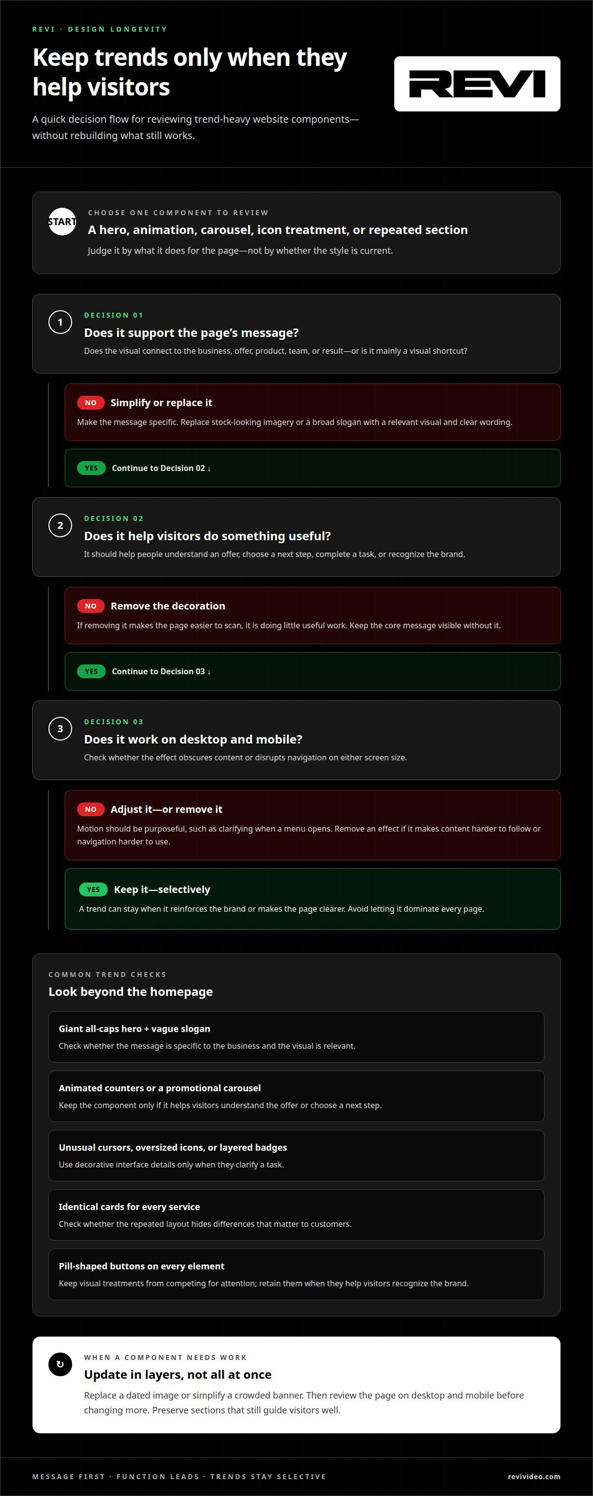
Design trends date fastest when they dominate a site without supporting its message. A giant all-caps hero, vague slogan, and oversized decorative icon may look striking at launch, then feel disconnected from the business. The problem isn’t using a current style; it’s relying on a visual shortcut that could belong to almost any brand.
Review trend-heavy components across the site, not just on the homepage. Animated counters, a carousel cycling through promotions, or pill-shaped buttons on every element can make a site feel tied to one design moment. These treatments can also compete for attention. Keep a component only when it helps visitors understand an offer, choose a next step, or recognize the brand.
- Generic hero layouts: Replace stock-looking imagery and broad slogans with a specific message and relevant visual.
- Decorative interface details: Use unusual cursors, oversized icon sets, or layered badges only when they clarify a task.
- Template-like sections: Repeating identical cards for every service can flatten differences that matter to customers.
Before adopting a trend, test it on a real page. On a service page, does a moving carousel explain the options better than a clear set of links? Does a dramatic hero image show the product, team, or result, or merely fill space? If removing the effect makes the page easier to scan, it is doing little useful work. Keep the core message visible without it.
Make updates in layers. First replace a dated image or simplify a crowded banner; then review the page on desktop and mobile. A focused website design review can help separate useful brand expression from decoration that distracts. That approach keeps the site current without rebuilding sections that still guide visitors well.
What website design principles remain timeless?
Timeless design helps visitors understand a page and complete a task without guesswork. On a bakery website, for example, someone should quickly find the menu, opening details, and ordering options. These practical choices matter longer than decorative styles because they meet real visitor needs. Build each page around what people came to do, then use visual details to reinforce that purpose.
Use predictable patterns for actions. A text link should look clickable, a button should describe its result, and the logo should lead to the homepage. For example, label a form button “Request an appointment” instead of “Submit” when that is what happens next. Familiar interactions reduce friction, especially for visitors using a phone.
- Clear hierarchy: Give each page one main message, then use descriptive headings to organize supporting details.
- Consistent components: Keep similar buttons, forms, and menus visually related, so visitors recognize how they work.
- Honest content: Use specific product descriptions and real team photos instead of generic claims or unrelated stock imagery.
Trust also depends on details matching visitor expectations. A contact page should offer a useful way to get in touch, and a service page should explain what the service includes. If a visitor clicks “View pricing,” the next page should present pricing information, not a vague sales pitch. Consistency makes the design feel dependable even as colors or imagery change.
Design for different ways of viewing and using the site. Descriptive subheadings can make a long page easier to scan, while clearly identifying required fields can make a form easier to complete. These choices support visitors with different devices, browsing habits, and access needs. Keep the underlying experience straightforward so later visual updates can refresh the presentation without disrupting familiar tasks.
How do typography, color, and spacing affect a website’s longevity?
Typography, color, and spacing shape a site’s visual identity and readability. A dramatic display font might suit a campaign headline, but using it for long paragraphs can make a page tiring to read. Pair expressive heading type with a simpler body font, and keep that relationship consistent across product pages, service details, and contact forms.
Color lasts longer when it supports brand recognition rather than chasing every new palette. Choose a small set of brand colors and assign each a clear role. For example, use one accent color for primary buttons and links instead of giving every section a different highlight. Check text against its background so visitors can read labels and calls to action comfortably.
Spacing establishes hierarchy. Tight gaps can make a page feel crowded, while large, uneven gaps can separate related details. Set repeatable spacing rules for headings, paragraphs, cards, and form fields. A product page, for instance, can use the same gap between each product name and description. Consistent rhythm makes future additions feel integrated rather than pasted on.
- Type: Establish heading and body styles, then apply them consistently.
- Color: Give each brand color a defined job, such as action, background, or emphasis.
- Spacing: Use a repeatable scale to distinguish related content from separate sections.
These choices also make refreshes easier. If a brand palette evolves, a defined accent role guides updates to buttons and links. If a headline font changes, a clear type hierarchy preserves the distinction between page titles and supporting copy. Make one visual adjustment at a time, then review a homepage, an interior page, and a form. This helps show whether the system still feels cohesive across different tasks.
Build a flexible visual system through website development for lasting design, with typography, color, and spacing working together from the start.
REVI: Website Development
REVI helps businesses shape websites that reflect their brand and support their goals. Turn to REVI when a new site needs a clear visual direction or an existing design no longer fits the business. REVI’s website development and design bring content, layout, and brand identity together in a cohesive, conversion-focused experience, without relying on every passing trend.
Start by defining what visitors should understand and do on each page. This gives the design a practical foundation while leaving room to refresh colors, imagery, or page elements as your business evolves. REVI’s brand-building service can also help establish a cohesive market presence.
Contact REVI to discuss your website development needs.
Build for what comes next
A website should support your next stage of growth, not lock your brand into one visual moment. If you’re worried your new website will look dated quickly, focus on making future changes manageable. Priorities may shift as your audience, products, or campaigns evolve. A flexible foundation lets the site grow with those changes instead of requiring a complete reset whenever one detail feels stale.
REVI connects website development with video production and ad buying, helping businesses align their online presence with content and visibility goals. This integrated approach can help when a new site needs to support upcoming campaigns or an existing site no longer reflects where the business is headed.
Choose the next step that fits your goals and timeline. Contact REVI about your website to discuss how you want your site to serve your business. Your next version can feel current, clear, and ready to move forward.
Frequently Asked Questions
How often should a business website be redesigned?
Redesign when the site cannot support a meaningful business change or help visitors complete an important task. A new service, for example, may need a different page structure, or an outdated booking flow may be blocking inquiries. Review the site when your offers, audience, or customer journey changes. If the structure still works, targeted updates may be enough; replacing the entire design may not be necessary.
How can I make a website look modern without chasing trends?
Make the site reflect the business as it operates now. Update old product photos, remove expired promotions, and replace copy that no longer matches your current offer. For a business serving Phoenix, Scottsdale, Gilbert, Mesa, Chandler, Paradise Valley, or Tempe, clear service information can help visitors quickly understand what’s relevant to them. Keep visual changes purposeful, and judge them by how well they support the page’s message.